

It May Be Winter Outside But In My Home It’s Spring
Edison browses Deirdre's Design Library and finds some light in these coldest months.


Finding ourselves in the depths of winter can certainly be testing on the senses. From the grey, overcast skies of the darkest days to the bare trees and chilling air on our skin, the longing for spring and summer to return, pulls heavily on many hearts. With the Christmas buzz of merriment and cheer gently faded, the countdown now begins as we look forward to a brighter, warmer future.
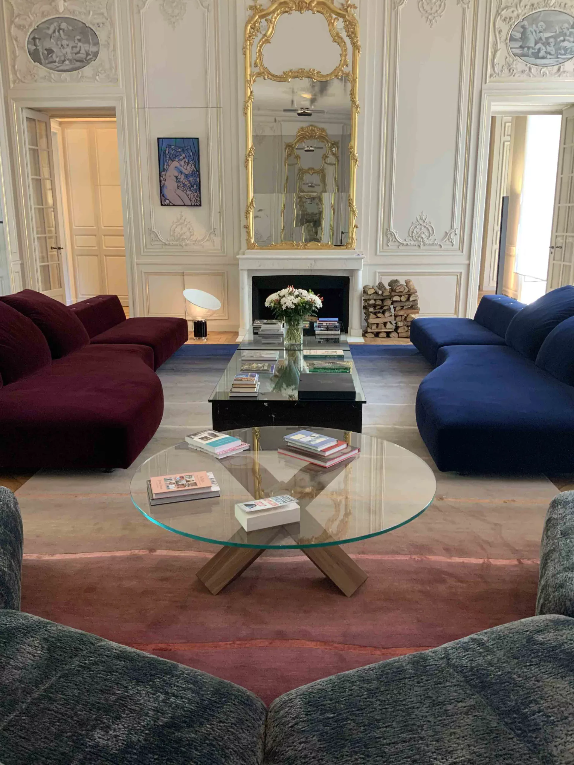
If you’re looking for a clever way to inject some vibrancy and make your home feel a happier place when the world outside may appear at its bleakest, why not consider unrolling a field of colour and up your floor game.
During the period when we spend more time indoors, winter is the perfect window of opportunity to prepare for the brighter seasons ahead- look at it as forward ‘seasonal’ planning for the home.
The beauty of bespoke is that you are not restricted to the colours you see on any of our examples, so colours can be easily switched up or down for preference – with over 5,000 to choose from.
With the right colour combination, you can help transcend and carry your home through all the seasons. During autumn and winter your environment should uplift you, whilst in the spring and summer it should appear more balanced in the brighter, warmer light. A carpet in the right choice of colour can really help with this, as it’s a far easier option than having to completely redecorate your home.


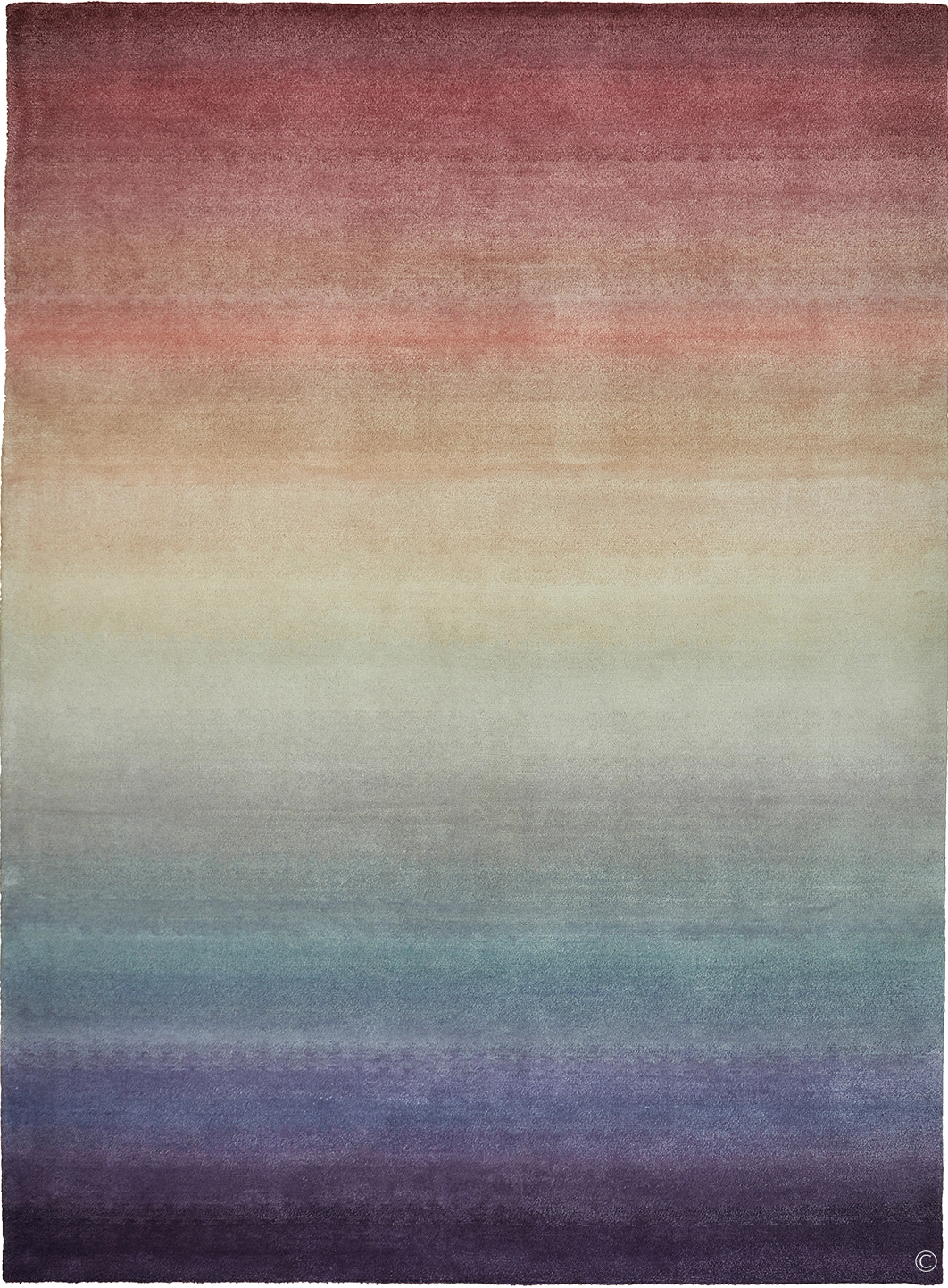
Rust/Berry options are a great choice and work well during Autumn and Winter when the leaves turn red, and Christmas colours are plentiful in the decorations and plants.
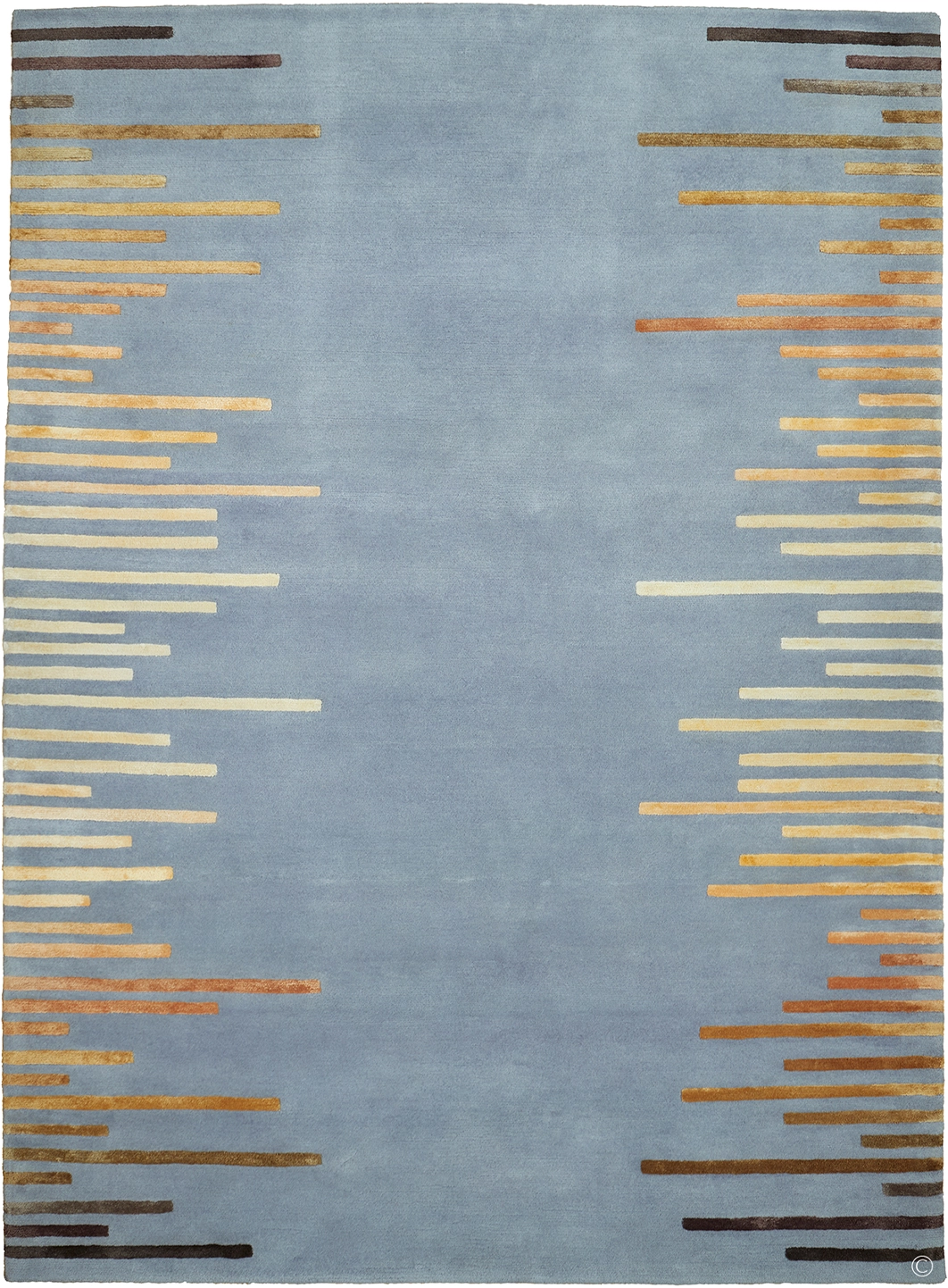
In summer these colours will appear fruitier and juicier in the vibrancy of spring and the intensity of summer sunlight, contrasting perfectly with the bountiful supplies of fresh flowers. Paired against a cooler backdrop such as in our IMPULSE design or blended in a graded silk and wool mix option such as TOPAZ, the gold elements will warm in cooler environments whilst the cooler tones of greys and blues will do the opposite in warmer temperatures.
Golds are a perfect palette resource for all-year-round colour comfort.
Neutral tones always add warmth to an environment. Our SUHAILAH design relies entirely in the contrast between the wool background and the silk highlights, creating the alluring, ancient pattern markings that remain timeless. The SKYSCAPE design illustrates how the layering of subtle differences in earthy shades and colours can create a dramatic effect, adding a luxurious feel and sense of warmth to a space, whilst providing a cooler platform during the hot summer months.
See our full design library for more inspiring designs!