

The enduring allure; an exploration of colour Grading
Edison explores the enduring appeal of ombre.
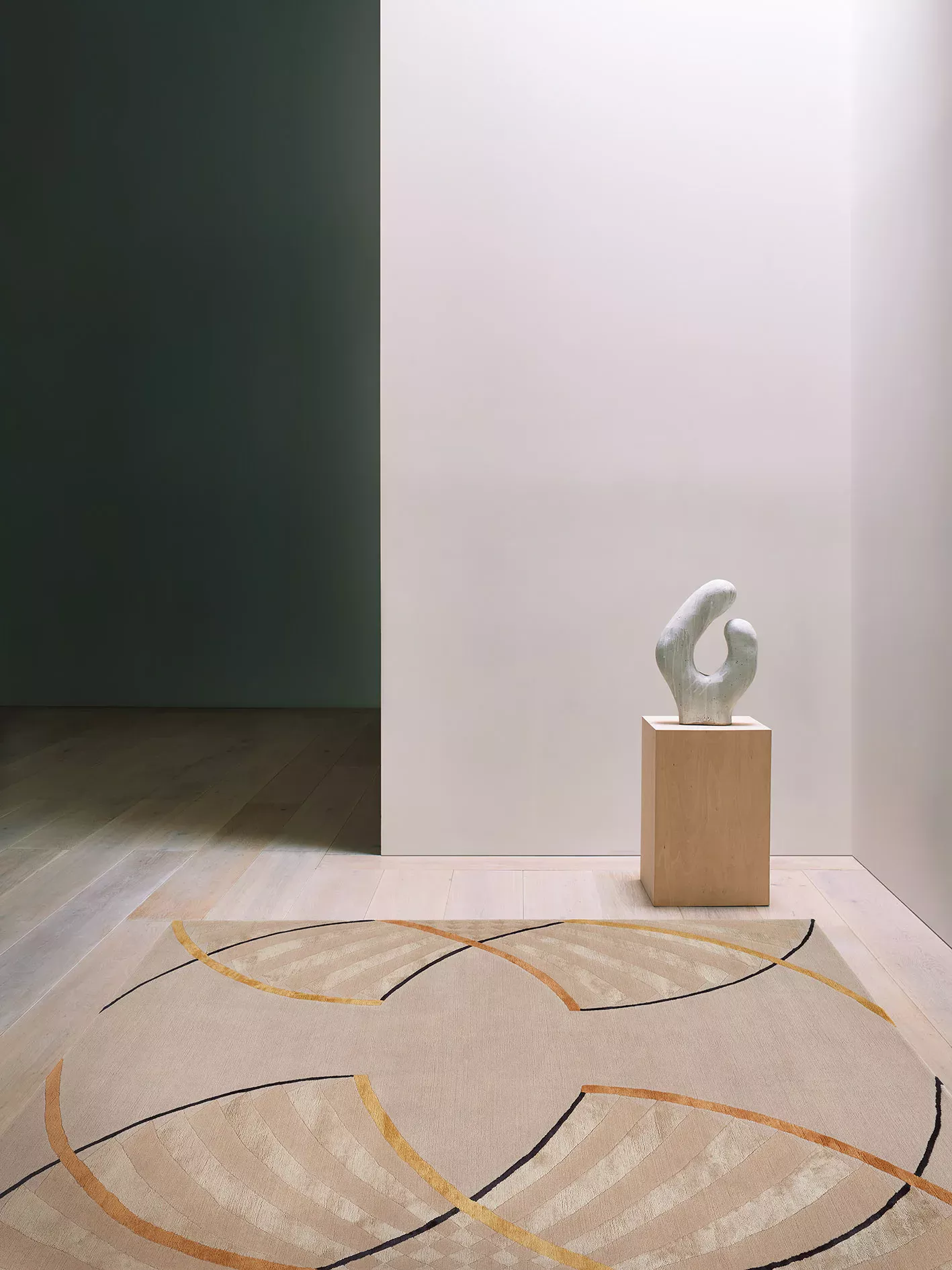
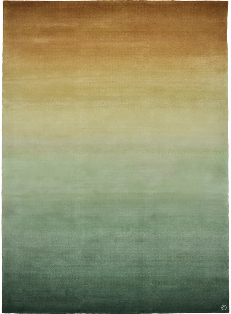
Deirdre Dyson’s Graduation collection for 2024 set a departure from her more recent graphical inspired designs such as Angles for 2023 and Paper and Stone in 2022. Challenging herself to create a collection that refrained from defining lines and segmented blocks of colour, Deirdre led herself to develop on two previous designs she had introduced as far back as 2019, MELTING SUN and AQUARELLE in 2021.
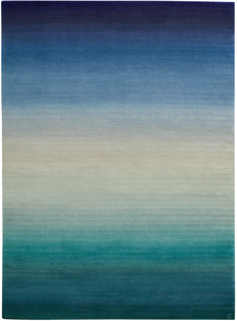
Both designs were inspired by the skill of grading colours that Deirdre had often incorporated into previous designs, such as SLIVERS, DAWN, SEASCAPE and UNRAVEL.
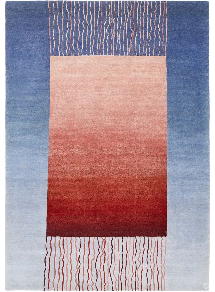
To dedicate an entire rug’s surface to one very simple but very complex knotting technique would require a necessary collaboration; the expertise of the craftspeople who traditionally hand knot our rugs on a loom and Deirdre’s professionally trained artist eye for colour.
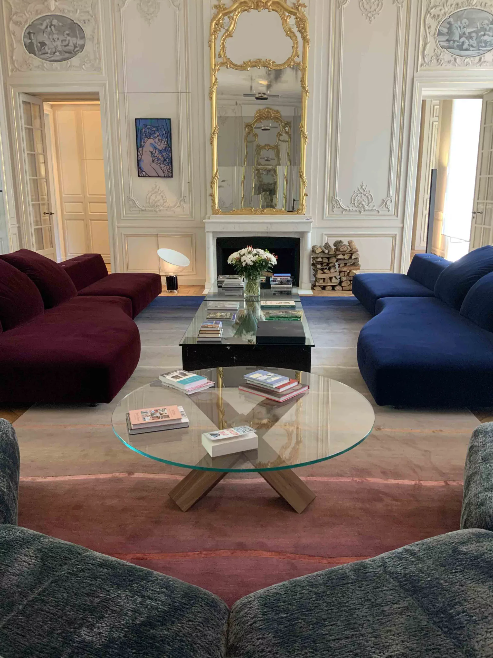
]The success of this has resulted in some perfectly crafted carpets that offer our decerning clients a collection that can fit most modern or traditional interiors. From the subtle uplifting hues of CASSATA, PLUMBERRY and VERDIGRIS, to the more vibrant punch of HELIOTROPE, there is something for everyone and options are available to change colours to meet a client’s specific brief.
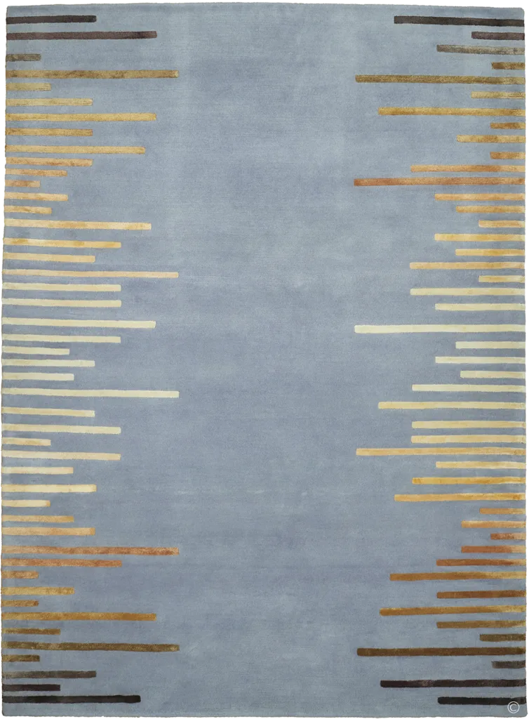
Graded effects can also be achieved by staggering blocks of colour close together as seen in Deirdre’s IMPULSE and INGOTS.
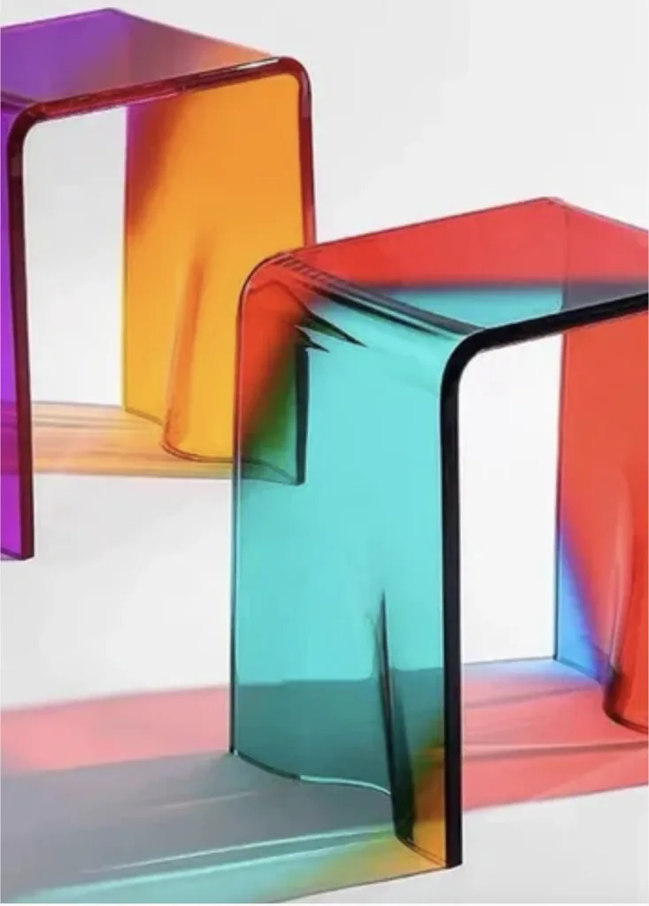
This ombre effect is a neat and subtle way to introduce modern colours into your home by shifting from dark to light tones or having the option to change from one colour into another. Think of it like water colouring your walls and floors. It’s both subtle but impactful. Not only can you achieve this look through a rug that will extend your chosen colour options by the sheer length and breadth of its expanse, but there are many other ways you can introduce ombre into your interior space. These acrylic AURORA side tables from The House Of BLOC are a fun way to add a two tone, graded colour into any corner of a home, making good stand-alone pieces.
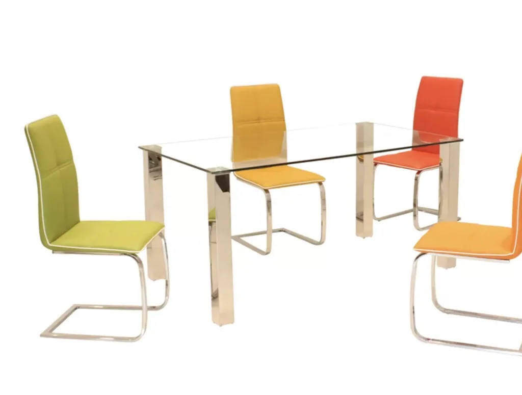
Think of layering different shades of dark blue and pale blue linen on a bed or dining chairs in colours close on the spectrum such as these Olveston chairs from Wayfair parked around a glass dining table.
Important to the ombre look is how light (both natural and artificial) will play on it. When choosing your colour options, it is important to consider how light will affect the mood and colour of the pieces throughout the day and evening, as the subtle end might appear too light under saturated light and the darker end too dark when there is a lack of it.
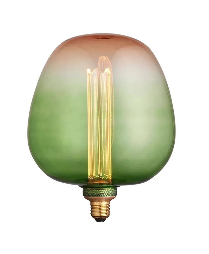
For very concentrated pops of ombre, why not consider changing your light bulbs to something such as the ROVES bulb from nationallighting.co.uk. These would offer an elegant and alternative way to illuminate that dark painted entrance hallway adding a subtle contrast to an already dark backdrop.
The beauty of ombre is in its subtlety and makes for a great option where introduction of colour is required without it becoming overbearing. For that reason alone, the ombre effect in interiors is here to stay. Explore Deirdre Dyson’s selection of ombre carpets here