

Thinking ahead? Think Blue – ‘Luminous Blue’
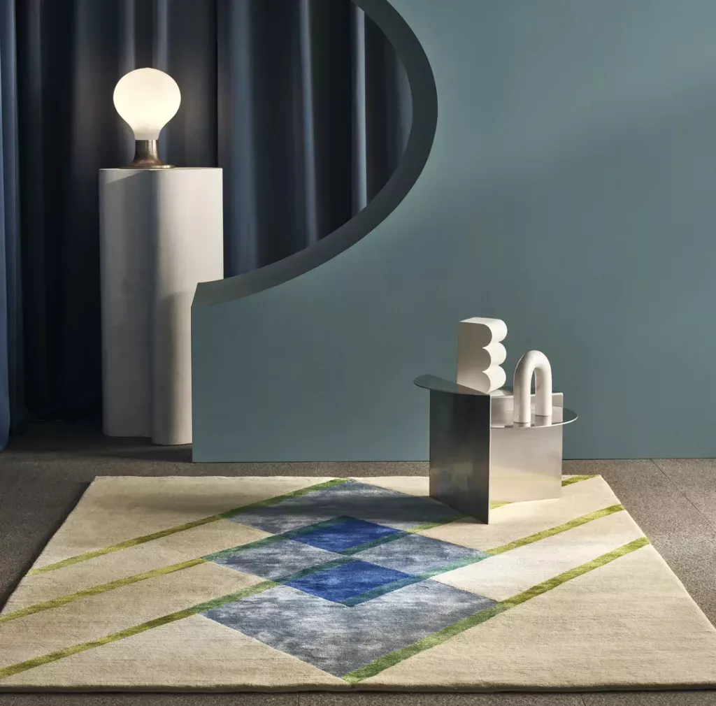
Edison delves into all things cerulean…
Leading consumer trend forecaster- WGSN and Coloro announced back in May 2025 that the colour on everyone’s lips for 2027 will be ‘Luminous Blue’.
Like a fierce lightning bolt straight from a heavenly cloud, this sumptuous, deeply vibrant colour is true perfection, made solely for the bold and not the faint hearted.
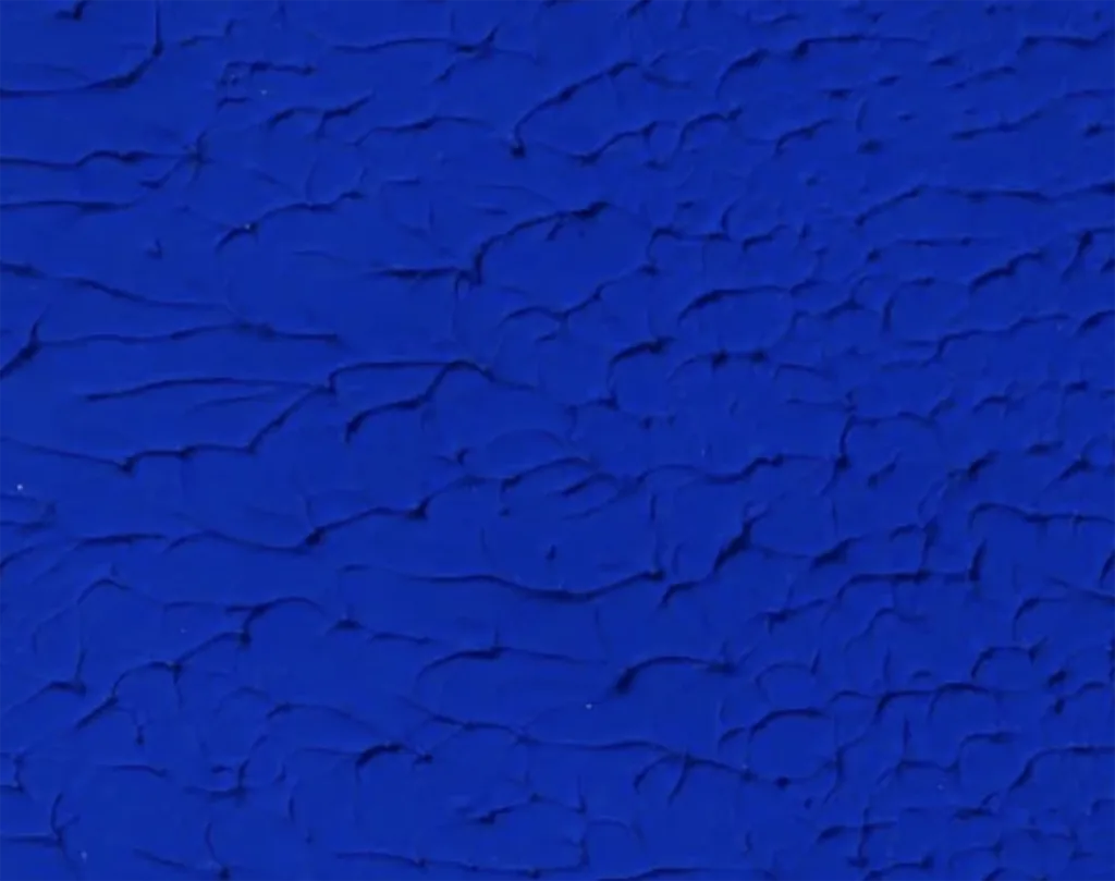
Similar to Yves Klien’s International Klein Blue (IKB) below, this recent take on ultramarine will harbour the intensity of a clear blue Mediterranean sky and deep blue waters.
With a departure from the safer muted tones of recent years, colour and vibrancy look once again to be embraced and reintroduced into our homes with passion and zest.
Whether accessorising with cushions or decorative objects, painted walls or rolling out a carpet saturated or lightly sprinkled with Luminous blue, there are many ways we can introduce this pure ‘blue joy’ into our spaces.
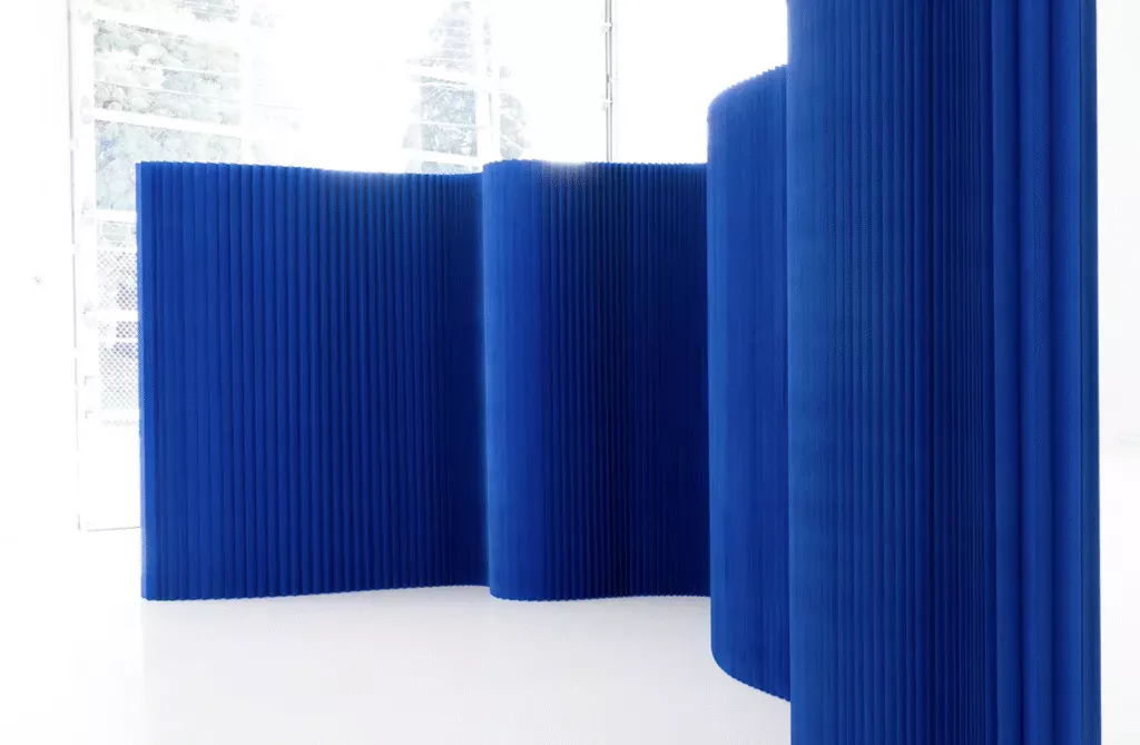
Architecturally inspired ‘Softblock’ flexible wall partitions by Molo Design are both practical and simply gorgeous. These Freestanding, paper textile walls can close off areas without entirely blocking out the light, keeping the luminosity of the blue intact. So, if permanency isn’t your thing, these offer a great solution that can be easily moved, folded or stored away.
Whilst Deirdre Dyson doesn’t necessarily follow trends, by nature of bespoke we often cross paths – sometimes years in advance.
With a multitude of private commissions under our belt and a comprehensive library of designs, there have been several creations adopting a similar colour to great effect.
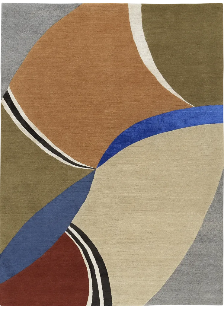
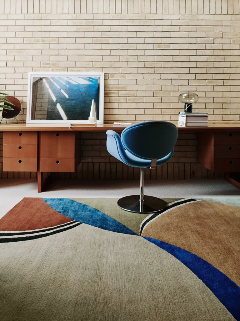
MANDARIN, with its mixed pattern and multi coloured segments, has a natural expansion from the centre outwards. Lending itself to infinite colour options, the striking blue in our example cuts through the muted tones like a sword of sapphire.
Our FLOATING GLASS carpet is an irregular, silky mix of blues and dark turquoise, showing the harmony of different and similar tones together where not too much contradiction is required.
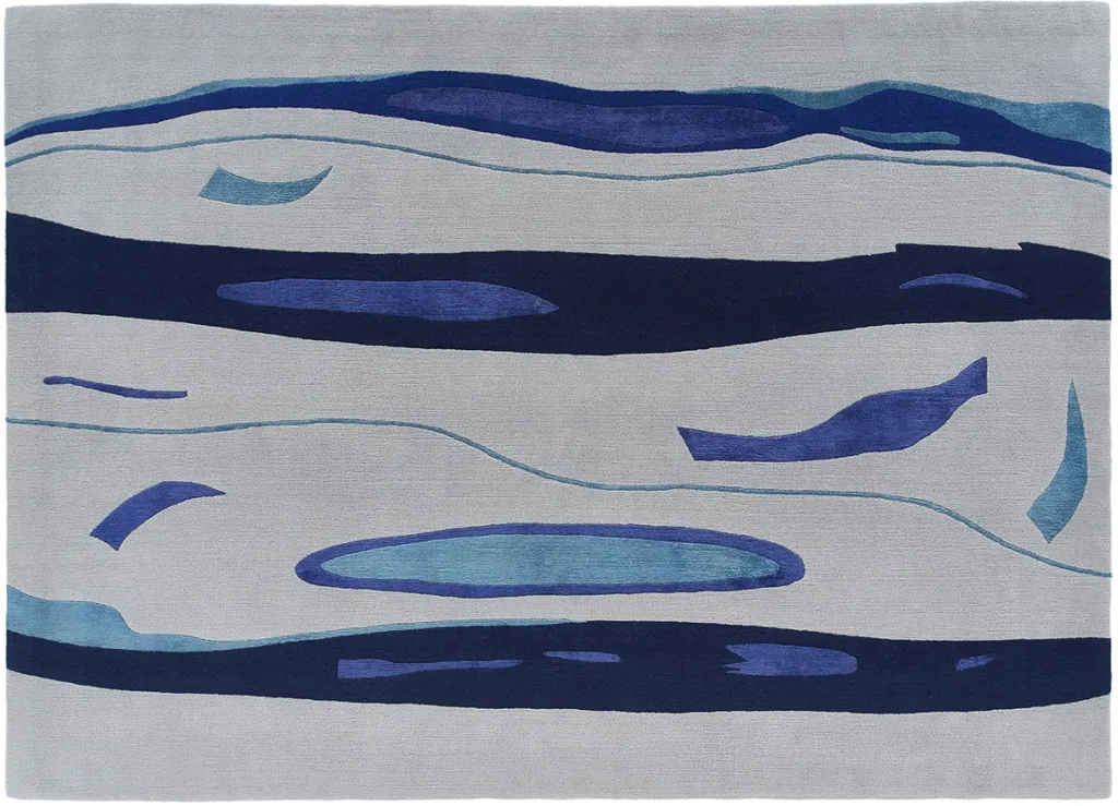
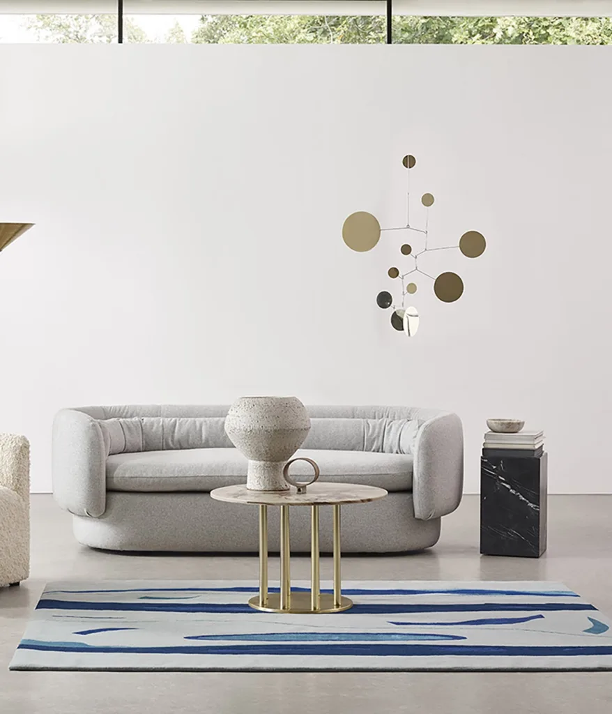
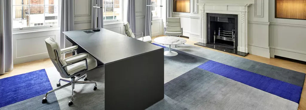
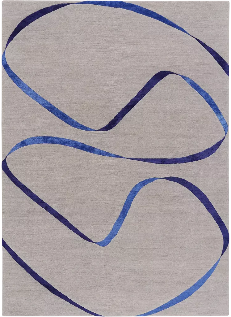
In STREAMER (below) softness and vibrancy entwine in this very simple design of a floating vibrant blue silk ribbon, billowing in the pale greyness of the muted wool background.
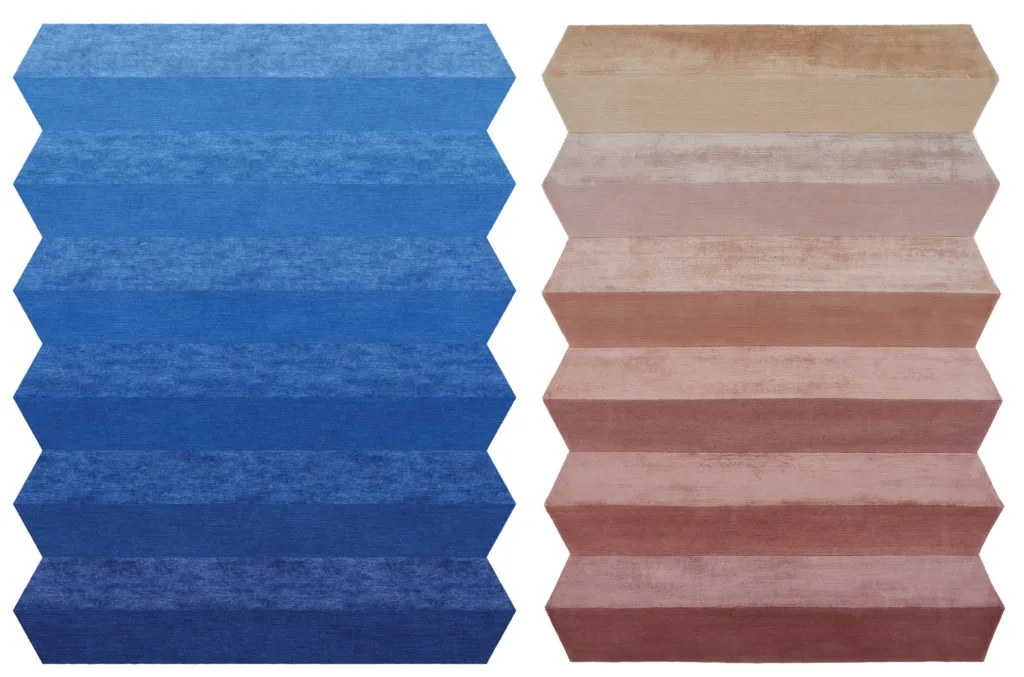
Finally, our CONCERTINA carpet was turned from pale, dusty, deep pinks to a vibrant IKB blue version to the request of a regular customer who is based in New York City. Our artwork below demonstrates the differences that are achievable and the beauty of bespoke.